AMBIENT:
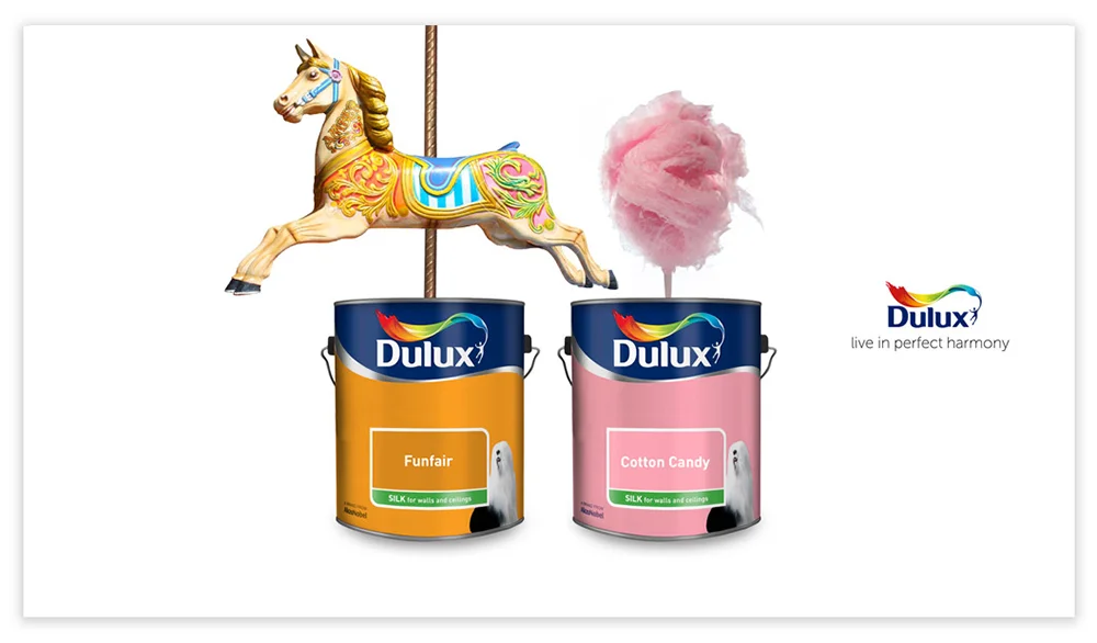
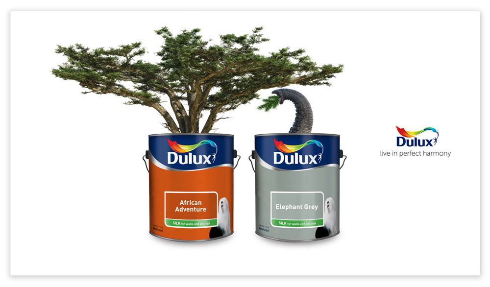
Large stickers resembling Dulux paint tin labels would be placed on items in public areas. Each sticker suggests a colour from the Dulux range that is relative to the object it is stuck on, playing with the idea of harmony and showcasing Dulux vast range of colours.


SOCIAL ACTIVATION:
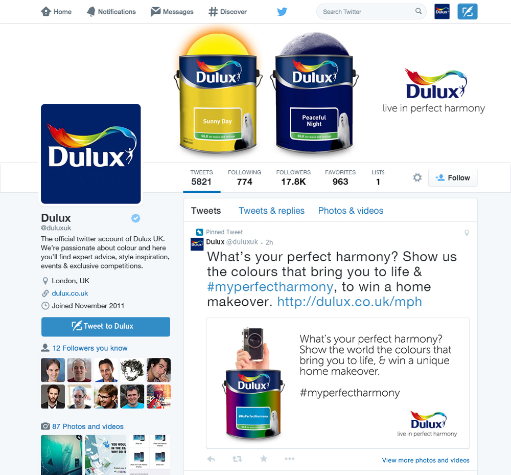
To push the idea of living in perfect harmony further, we would ask the public 'What's your perfect harmony?' A photographic competition would take place across Facebook, Twitter and Instagram, asking followers to take pictures of colours that mean something to their lives. We would use influencers from the British creative industries to take part in the activation to gain awareness and set the tone of the imagery, alongside judging the entries.
Followers would post images of any colour that connects with them, with #myperfectharmony. A Dulux microsite would display all images with the hashtag, allowing viewers to see a whole spectrum of colour and vote for their favourite images. The top 50 images voted for by the public are then shortlisted to be judged by the creative industry influencers. The final winning images would be showcased on the site, with a feature on the person and their colour.


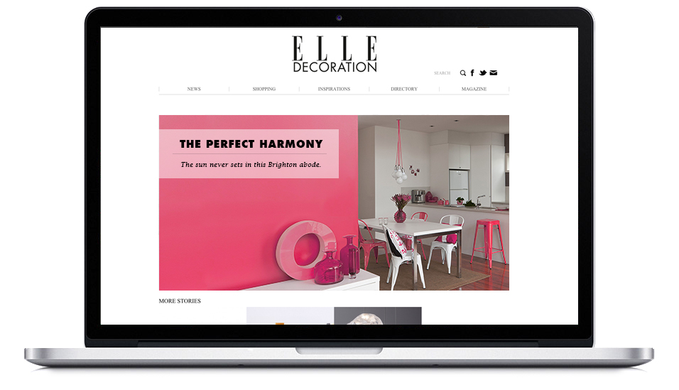
The winners of the competition would receive a home makeover with a celebrated interior designer, incorporating their winning colour. These makeovers would be documented and featured in relative lifestyle magazines and blogs to enhance the experience for the winners and exposure for the campaign. The winning paint colours would be available to the public as a limited edition in custom paint tins displaying the winning images.